LeeMing Ink Studio - Human Face
LeeMing - Peach Blossom on Human Face
Interesting ink! It’s really beautiful on good-quality papers, but on others it can be quite frustrating. It’s from LeeMing Ink Studio in Taiwan, and from what I can tell, the name on the bottle translates to “Peach Blossom on Human Face”.
LeeMing Ink Studio Human Face ink color
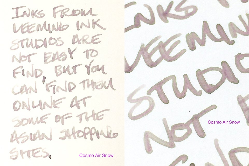
When it first goes on the page, it really is almost a dirty dishwater blend of grey, yellow, and green. On some papers (like office copy, and the writing on my swatch card) it stays that way. In these cases, it’s not particularly attractive, and it’s only really practical in wet, broad nibs. However, on good-quality papers a beautiful, mysterious pink emerges. (Check out the writing on the Cosmo Air Light and Tomoe River swatch images!) When this happens, it’s quite attractive and very readable. It’s beautifully complex, unusual ink.
Ink Swatches on Cosmo Air Light and Tomoe River
Writing is very good in terms of performance. It’s a very wet ink (I’d love to thicken it a bit to see how it reacts.) I didn’t have any problems with feathering, and on good papers it has a nicely defined, green stroke edging that really stands out. I don’t think I’ve seen that color combination before, either, certainly not such a bold, electric green edging. Drying was a bit quicker than average, too.
Writing sample on Cosmo Air Snow paper
If this ink always looked the way it does on those premium papers, I think it would be a strong recommendation, but it really needs the right nib and the right paper to give you beauty and readability. I used a Pilot Custom 91 with an SFM nib to get width. I’d recommend broad nibs. In a fine nib on office copy it is far too faded, and more dirty dishwater than peach blossom.
LeeMing Human Face ink writing samples
The second problem is finding it. This isn’t an easy brand to find. Pen friend @artfromtheginden sent this with a bunch of other beautiful inks to review. (Thanks, Rachael!) She got it on Taobao, and I’ve seen them on AliExpress in the past. I have a couple more from LeeMing to review, and they’re very nice, so if you’re interested the Asia-based shopping sites are a good place to look.
LeeMing Ink Studio Human Face - Swatch Card
LeeMing Human Face - Comparisons
LeeMing Human Face - 30 ml Bottle & Box


