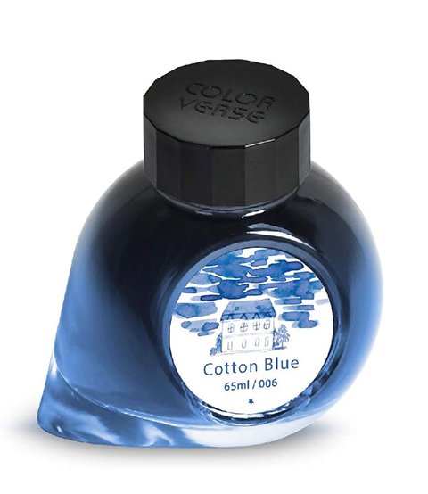
Colorverse - Cotton Blue
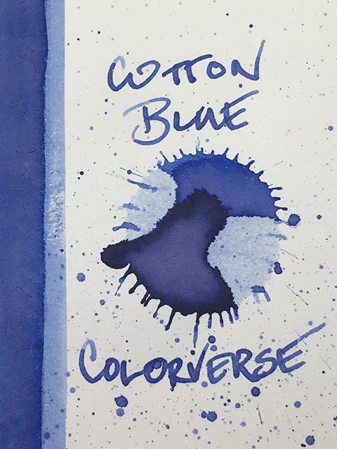
Colorverse - Cotton Blue - Ink drop
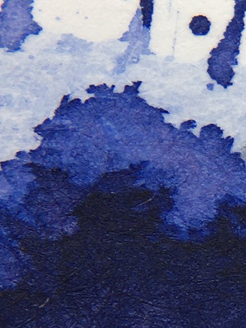
How has Colorverse Cotton Blue not gotten more attention?! From the name, I expected a blue, maybe a bit undersaturated to give it a cottony appearance. What I found was a beautifully deep, but delicate, blue with agressive pink and orange undertones that turn it in to a violet-blue. To me, it’s simply stunning!
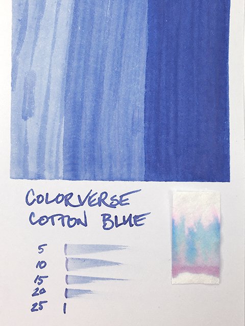
Colorverse Cotton Blue fountain pen ink color range
The base color is a soft, yet confident, medium to dark blue. Visually, there is a hint of powdery grey that makes me want to call it a slate blue, but it’s more vibrant than most slate blues. But wait - that’s just the base!
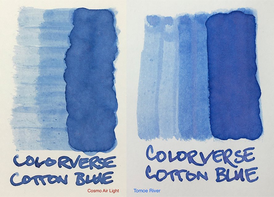
Ink Swatches on Cosmo Air Light and Tomoe River
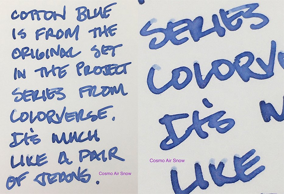
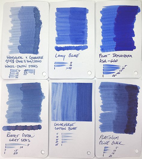
Intense undertones show everywhere! Written stroke centers (I used a Jowo medium) swirl and tumble with pinks and oranges. They’re aggressive on both coated and uncoated papers. They change the base blue, giving you a beautiful violet-blue with hints of pink. It reminds me a lot of Troublemaker Milky Ocean and Robert Oster Grey Seas, but it’s more usable for an every day ink than Milky Ocean, and it’s more upbeat and optimistic than Grey Seas.
Nice definition and undertones on Cosmo Air Snow paper
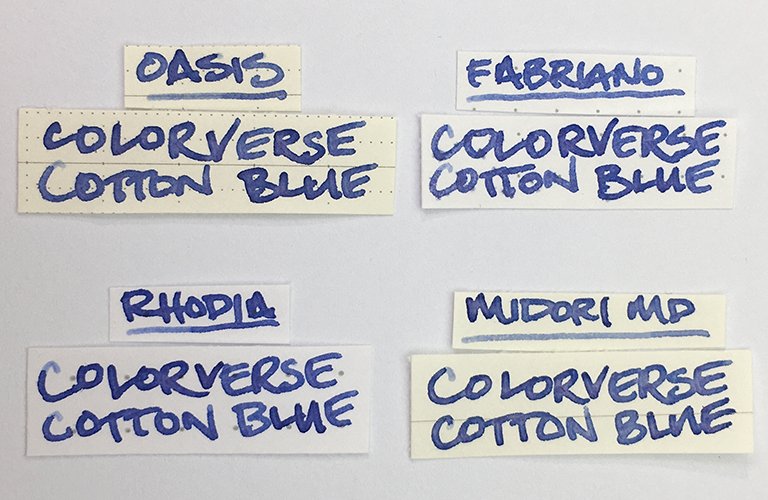
Writing performance was quite good, overall. It’s fairly wet in flow and comfortable on the page. On coated papers, strokes were clean, sharp, and feather-free with a nicely defined edge. On some uncoated papers, there’s a little spreading, but it isn’t a feathery mess on most. You’ll find some show-through on office copy, but bleeding is minor. Drying times were average to a touch longer at the worst. If you’re using good papers, you’ll like the results.
Colorverse Cotton Blue ink writing samples
For me, this is a beautiful ink. It’s very on-trend for inks over the past couple of years. If you often choose blues, I highly recommend you explore Colorverse Cotton Blue. And for creative projects, I think a water-brush will give amazing results! You’ll find it in the very nice, 65 ml, ink drop bottle for US22-25 at many online retailers.
Colorverse Cotton Blue - Swatch Card
Colorverse Cotton Blue - Comparisons
Colorverse Cotton Blue - 65 ml Ink Bottle
