BlueBlack x Diamine - Skyscrapers
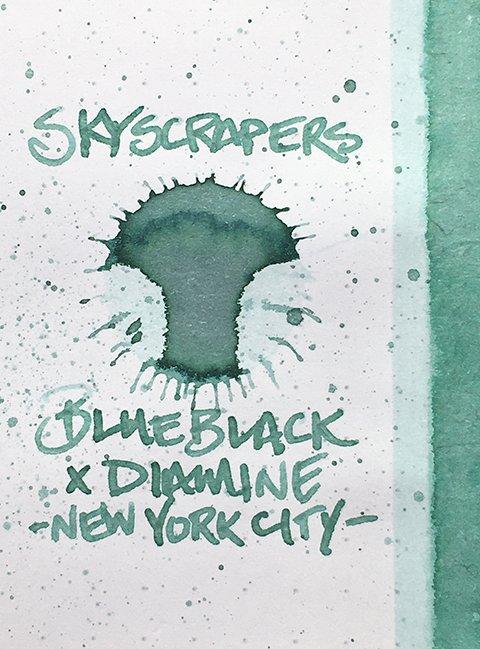
BlueBlack x Diamine - Skyscrapers - Ink Drop
Diamine Skyscrapers, the eighth ink in the BlueBlack-exclusive New York City set, reminds me of the color of tropical Carribean waters as they meet sandy, island shores or the lightest blue skies. The color’s connection to the ink’s name is clear.
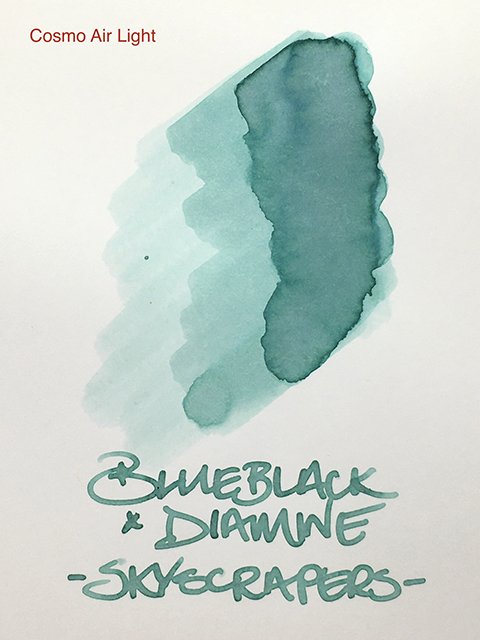
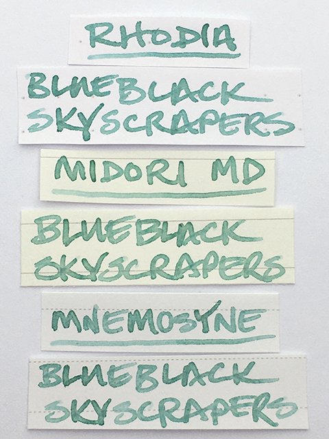
Skyscrapers on Cosmo Air Light
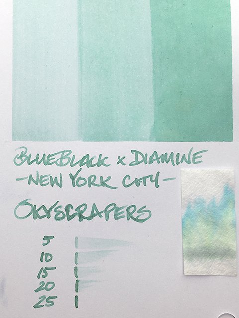
This is a beautifully soft and graceful turquoise or aquamarine. It’s gentle and powdery with shading from light to lighter with translucency. It’s another dual-shading ink in the set, too. Undertones of pink and peach are very visible in the ink splat, swatches, and writing samples on Cosmo Air Light and Tomoe River papers. You don’t find it on all papers, but when you do, it’s a beautiful accent on saturated stroke centers.
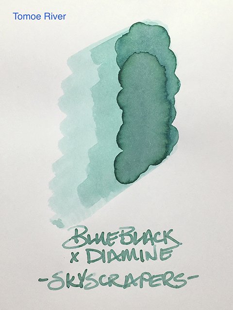
Skyscrapers on Tomoe River Paper
On coated papers, there’s a very pronounced dark stroke edging that adds depth and definition, making it easily readable. Uncoated papers bring out more yellow and make it less interesting to me.
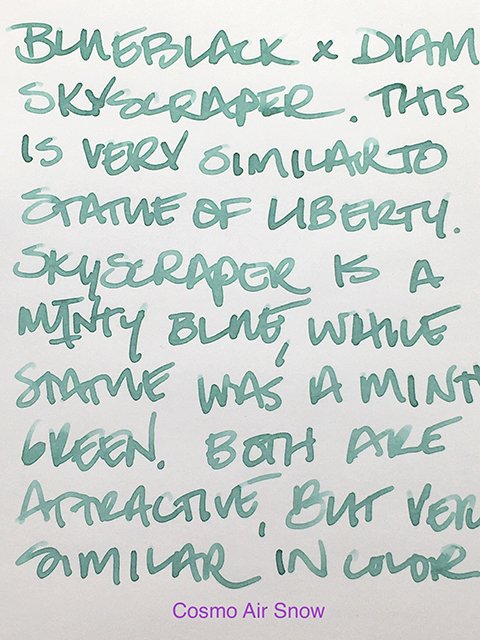
Writing Sample on Cosmo Air Snow
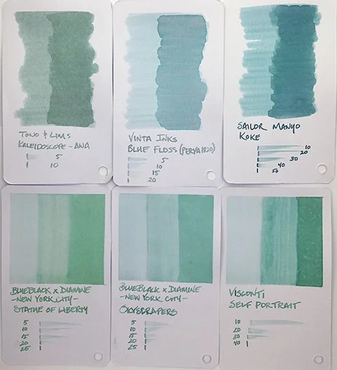
At first glance, I thought Skyscrapers was identical to Statue of Liberty (the sixth ink in the set). However, when you see them side-by-side, the differences become clear. While Statue of Liberty is a green-leaning aquamarine, Skyscrapers equally leans blue (particularly on coated papers). The two inks are more fraternal twins, rather than identical twins.
Skyscrapers - Writing Samples
Writing performance has consistently been very good throughout the ten inks in the set, and that excellence continues with Skyscrapers. Diamine did a great job formulating these inks.
Ink Color Comparison - Skyscrapers & Statue of Liberty
On its own, this is an excellent writing ink and a beautiful color. I always like inks that have hidden surprises and well-defined stroke profiles. It’s also a very beautiful set of ten. You could argue that Skyscrapers and Statue of Liberty are very similar, and in a sense, they are. However, they are also quite different when seen together. I think there’s room in a ten-ink set for both a soft light blue and a soft light green. If you like aquamarines, you’ll appreciate having both.
Writing Comparison - Skyscrapers & Statue of Liberty
Special thanks to BlueBlack for surprising me with this amazing set! Their store in Seoul is a must see for pen and ink lovers, and if you have a chance to stop by, definitely do!
Keep scrolling down for the ink swatch card, swatch comparisons, the 30 ml bottle, and a view of the complete set!
Skyscrapers - Ink Swatch Card
Skyscrapers - Swatch Card Comparisons
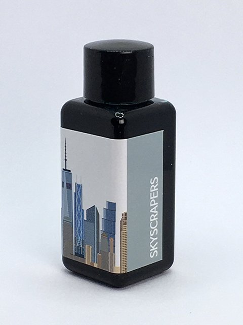
BlueBlack x Diamine Skyscrapers - Ink Bottle
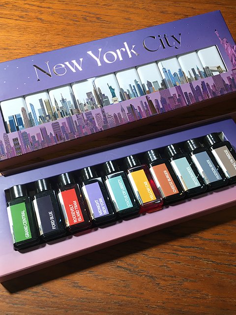
BlueBlack x Diamine - New York City Set

