3 Oysters - Doldam
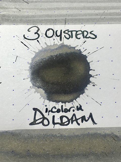
3 Oysters Doldam - Ink Drop
This is 3 Oysters Doldam. It’s part of the I.Color.U series of inks based on colors found in Korea culture and geography. In Korea, palace gardens and grand, traditional houses are often surrounded by beautifully constructed, grey stone walls called “doldam” (“dol” meaning “stone”, and “dam” meaning “wall”). The tops of doldams are usually covered with dark grey, slate tile work. As time passes, the grey stone takes on earthy hints of yellows, greens, and light browns from the natural growth of lichens and age. 3 Oysters Doldam perfectly captures the strong light and darks greys of the stone, and the organic colorations of time.
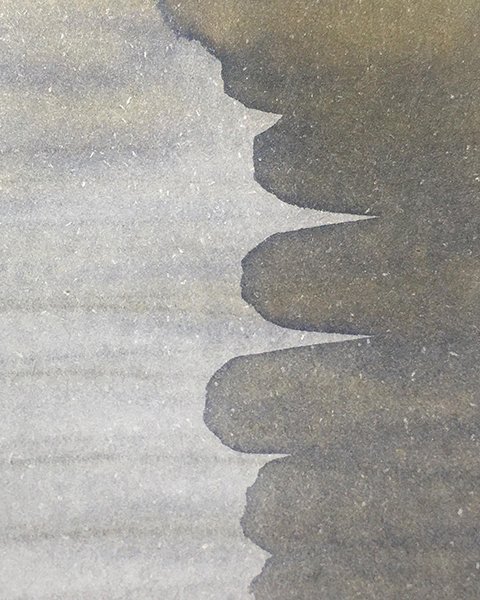
3 Oysters Doldam’s many hidden colors!
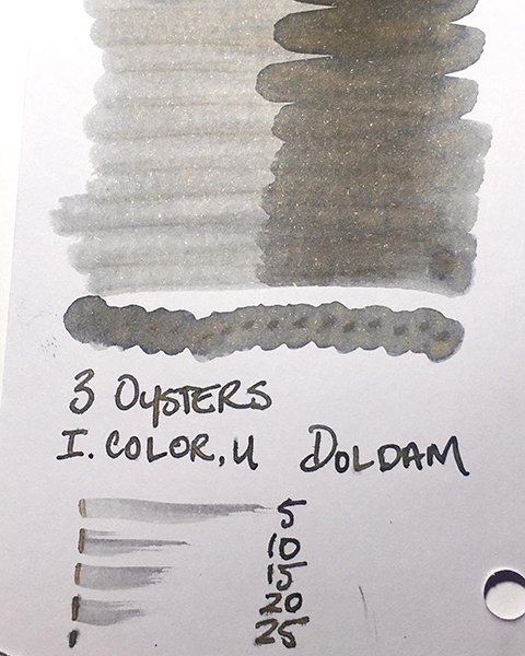
This ink is more complex than one might first imagine. As shown in both the splatter and the swatch, Doldam begins as a clean, clear grey ranging from a light smoky grey to a dark slate grey depending on the wetness, and application. In more saturated areas and areas of pooling, a dusty, organic yellow gradually appears with subtle hints of green and brown. Doldam is also a lovely shading ink! I love complex greys with multiple undertones.
Nice drying times
As a writing ink, there are traces of the yellow when using broader, wetter nibs. Strokes are clear and crisp, with highly defined edges making it very readable as a writer. It’s well-behaved and dries reasonably quickly. I’m not a huge fan of simple black inks, but grey inks like this intrigue me. Much like black & white photography, a good grey ink is a powerful medium, and can convey more with seemingly less.
3 Oysters is a company to watch, and Doldam is a beautiful ink. It’s quickly become one of my favorite greys!


