
Wearingeul - Path
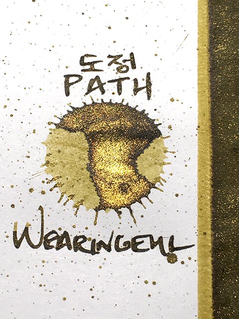
Wearingeul - Path - Ink Drop
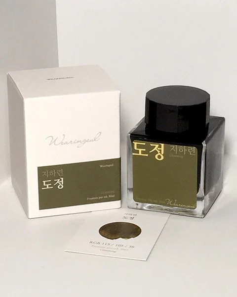
Today’s ink is from Wearingeul’s four-ink, Korean Female Modern Writer series. Called 도정 (or Path in English), it was inspired by sunlight between the leaves of trees. It’s dedicated to 지하련 (Ji, Ha-Ryeon), an important writer and literary theorist whose life was tragically upended by the war in Korea and the on-going national division.
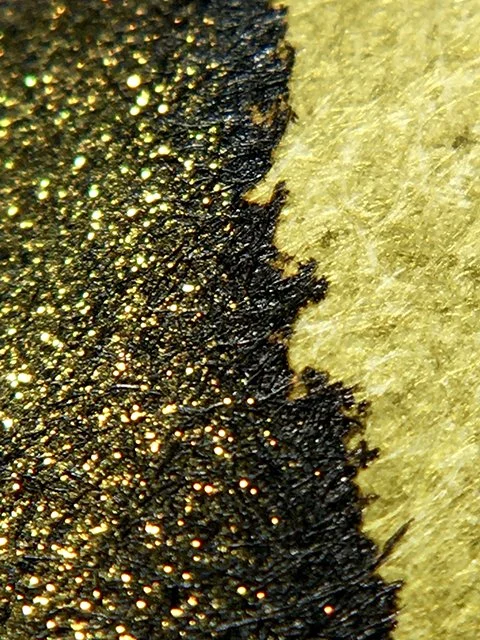
Wearingeul - Path - Color Range
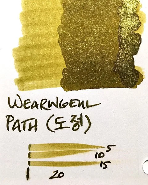
Path is a beautiful, verdant, dark olive green. It’s earthy, organic, and lush, and nicely saturated, as well. As the gold embossing on the bottle’s label indicates, this is a gold shimmer ink. An intense, deep gold shimmer mimics the optical effects of sunlight through the trees. There’s shading on many papers, with light areas showcasing brighter, yellow-greens that contrast the base color nicely. All of this makes Path a very attractive, very likable ink.
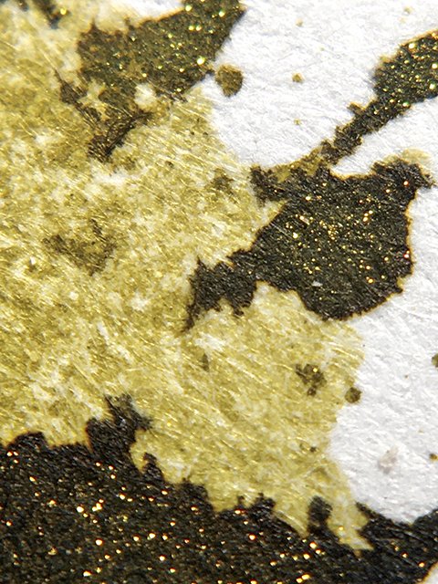
Wearingeul - Path - Light to Dark
Path performs very well, too. It behaves nicely on the page, remaining crisp and clean at all times. The shimmer hasn’t caused any problems, nor have I had issues with crusting (dark olives can sometimes cause a bit of crusting in my experience). It’s a nice writing ink.
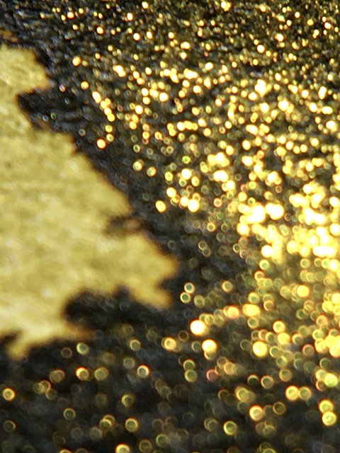
Wearingeul - Path - Ink Shimmer
I’m super impressed with Wearingeul’s attention to detail. The bottle is solid and lovely, and reminds me of the Sailor Manyo bottles. The ink is packaged in a very elegant, double-layered box, and includes a swatch card with the RGB code of the ink. Everything screams of quality here. I love companies with an eye for detail and high standards, and I think you’ll enjoy Path.
Wearingeul - Path - Ink Swatch Card
You can find more information at Wearingeul, or their parent company's site Able Design to see what other stationery-related products they offer. Enjoy!
Wearingeul - Path - Ink Bottle and Box
Please note: Wearingeul sent this and several other inks over for me to try, but that hasn’t colored my judgement in any way. As always, my reviews reflect my honest opinions.