Visconti - The Red Vineyard
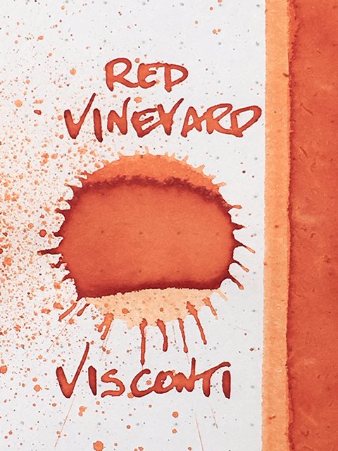
Visconti - The Red Vineyard - Ink Drop
Visconti The Red Vineyard performs as well as the other inks in the Van Gogh series that I’ve reviewed, and by that, I mean very nicely. In color, it will delight some, but might be too bright for others. Either way, it’s a very nice ink. Let’s take a look.
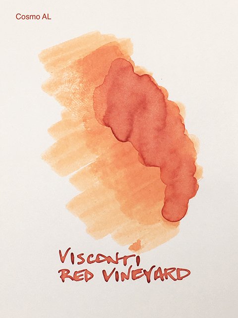
Visconti - The Red Vineyard - on Cosmo Air Light
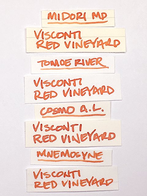
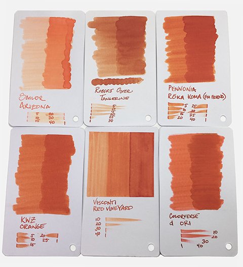
This is a bright, red orange. On many papers, it’s difficult to categorize it as more of one or the other. I like that. It isn’t garish, but it definitely isn’t shy. It’s far more restrained than something like Pilot Iroshizuku Fuyu-gaki.
Visconti - The Red Vineyard - Color Range
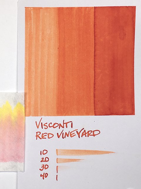
This is a strong shading ink on uncoated papers. There’s wide variation from dark to light on every stroke. Light areas remind me of orange cream ice cream, while darks are a deep red orange.
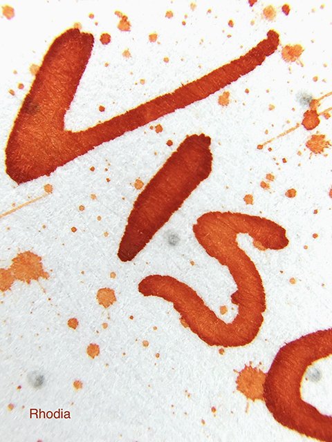
Visconti - The Red Vineyard - on Rhodia
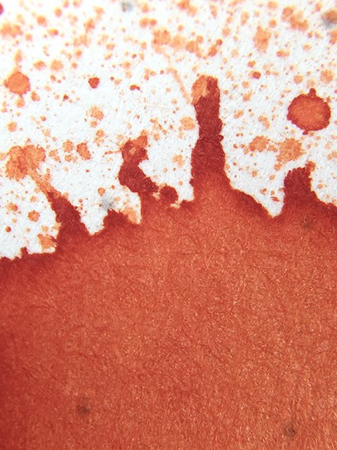
On coated papers, there’s often a darkened stroke edge and an inner glow. Red influences are stronger here, and I think of under-ripe tomatoes hanging on a garden vine.
Visconti - The Red Vineyard - Writing Samples
The Red Vineyard is neutral to slightly wet in flow, and it’s a very comfortable writing ink. It performed very well on all of my test papers. I didn’t have any problems with feathering, and on good quality copy paper there was only modest ghosting. Drying was fast to average, too.
Visconti - The Red Vineyard - Ink Swatch Card
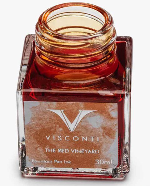
Visconti The Red Vineyard and the other Van Gogh series inks come in very nice, square, 30 ml bottles. You’ll find them for US$19 at many popular online retailers. This color is very attractive, but it won’t be for everyone. I can see myself using it for writing long notes or editing. It’s restrained enough to be comfortable and very legible in full pages of text. If you like the color, don’t hesitate!
Visconti - The Red Vineyard - Comparisons
Visconti - The Red Vineyard - 30 ml Bottle

