Van Dieman’s - Peanut Brittle
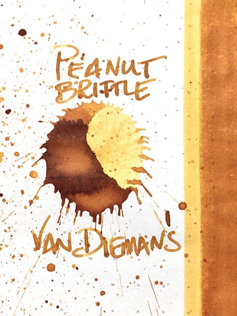
Van Dieman’s - Peanut Brittle - Ink drop
Today’s ink is Peanut Brittle from the Australian ink maker, Van Dieman’s Inks. It’s part of their Season six, Harvest series. These are inks that are named for and inspired by the rich bursts of color of the delicious produce of Tasmania, where the company is based. Sweet and savory, peanut brittle is a crowd favorite at harvest festivals and farmers’ markets, and the color is a natural inspiration.
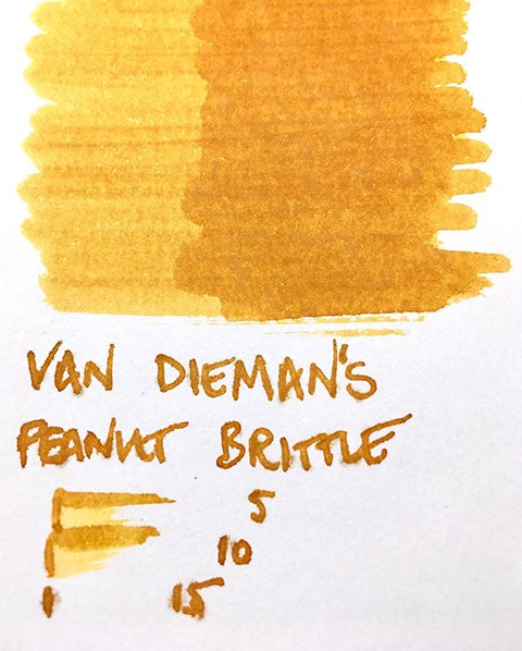
Van Dieman’s - Peanut Brittle - Color Range
Visually, Peanut Brittle is a gorgeous, warm, comforting ink. The base color is a golden yellow caramel. It isn’t an aggressive shader, but there is fairly considerable shade and tone variation. The variation comes in broad gradients which give the ink a soft, mild appearance, and is quite attractive. On premium papers, there is a subtle, yet effective stroke halo edging, as well, which adds definition without distraction.
Van Dieman's - Peanut Brittle - Ink Swatch Card
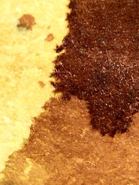
As a writing ink, Peanut Brittle performs very successfully across a wide range of papers. Strokes were crisp and clean on all papers tested except Apica, which showed slight feathering. Shading was consistent across all papers, as well, but it was stronger on coated papers. The splatter shows rich, burnt butter edge darkening, and a tiny hint of sheen. There was no sheen in writing, but a modest stroke halo was seen on all premiums. This ink is neither wet, nor dry, but flow was consistent and smooth. Drying was quick at 10-15 seconds on premiums, and under 5 seconds on office copy.
As someone who is allergic to peanuts, this is the first time that I can honestly say, that I love Peanut Brittle! It’s a gorgeous ink, and a great writer, too. Van Dieman’s makes beautiful shading solids, and lovely shimmer inks, as well. Save room for Peanut Brittle - it’s a delicious ink!


