Papier Plume - Red Beans and Rice
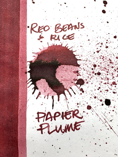
Papier Plume - Red Beans and Rice - Ink drop
This is the deliciously named Red Beans and Rice. Named for the iconic Louisiana creole dish that inspired the color, this ink could only come from New Orleans-based Papier Plume.
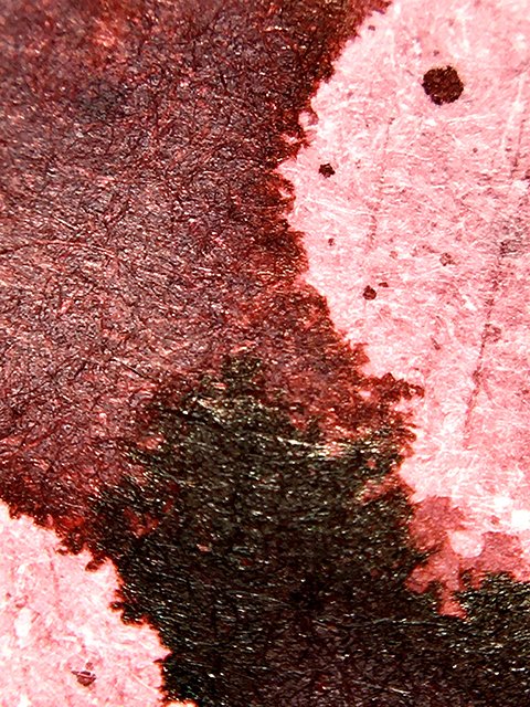
Visually, this ink truly does look like red beans! It’s a deep, powdery, red wine red, both soft and cool. There’s a lot of nice shading variation, especially on coated premiums. The lighter areas resemble the inside of the beans, while the dark areas mimic their outer skins. There is stroke halo on premium papers, and it helps clarify stroke profiles without stealing attention from the beautiful color. This is a good-looking ink!
Papier Plume - Red Beans and Rice - Ink color variation
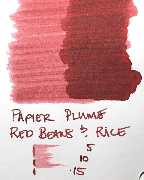
As a writing ink, Red Beans and Rice is easy to like. It blends the best qualities of both wet and dry inks. It’s smooth and comfortable, and well-behaved, too. Strokes were sharp and clean on all six test papers. Shading was visible on all, with a mild halo on everything except office copy. Personally, I preferred the greater contrasts seen on coated papers, but it wrote well on all papers tested.
Papier Plume - Red Beans and Rice - Ink swatch card
I love the look of this ink, and it performs very well. It’s nicely versatile, too, and is usable on a wide range of papers. Like other inks from Papier Plume, it’s also priced very reasonably. The name brings a smile to my face, but it’s using the ink that keeps it there! Enjoy!


