Krishna Ink - Plum
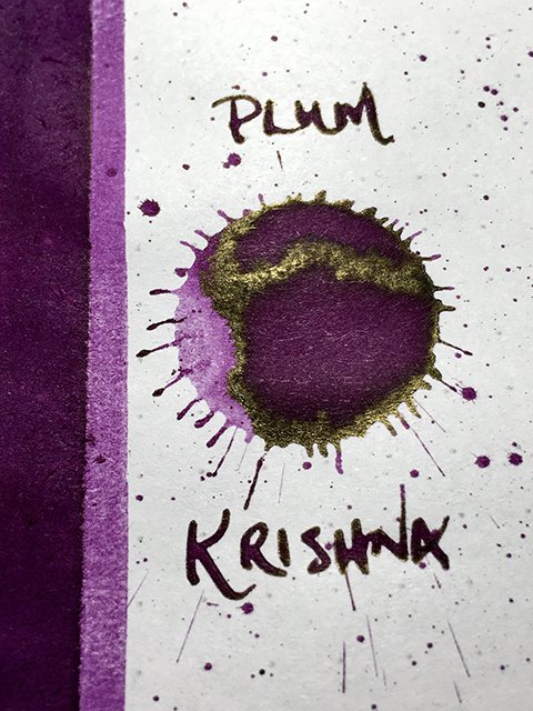
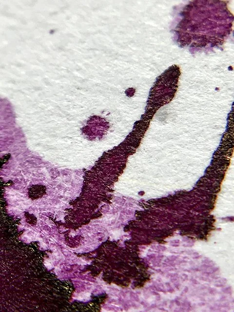
Krishna Ink Plum - ink drop
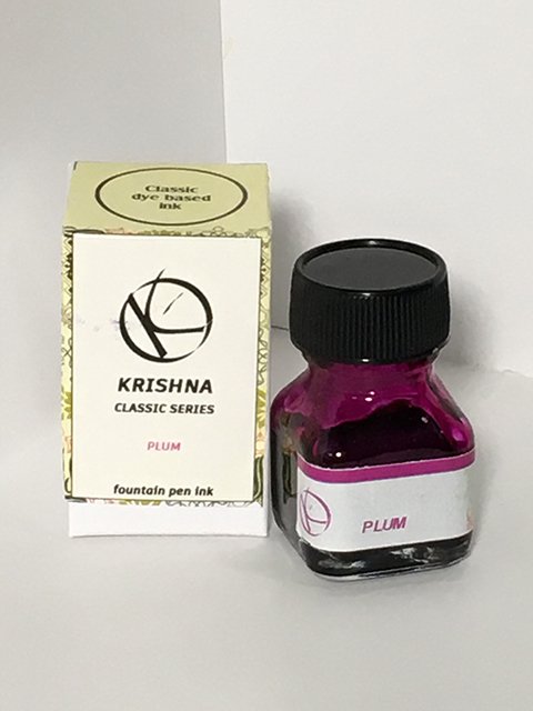
Krishna’s classic series consists of six dye-based inks. Formulated for everyday use, they’re described by Krishna as “easy flowing, non-staining, and zero maintenance.” They’re nicely saturated inks, and Plum is the first one that jumped to my attention.
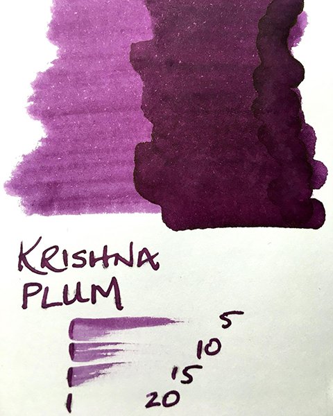
Krishna Ink Plum - color range
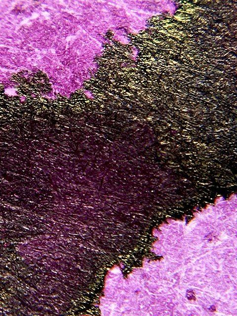
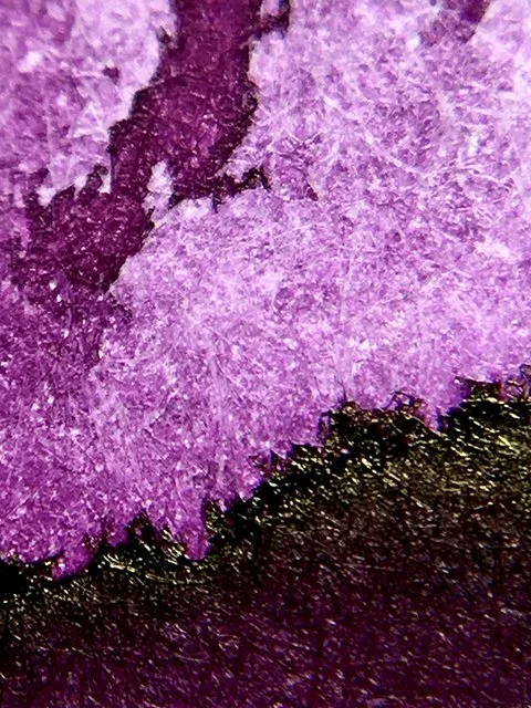
Plum is a pleasant, deep violet with only a hint of purple. To me, it’s less plum and more aubergine or eggplant. I think of plum as having stronger, more extroverted red-purple influences, whereas here (especially in writing), it really runs more dark violet. Broader nibs on coated papers allow lighter shades and tones to show, while finer nibs promote deeper, darker line coloration. Overall, it’s definitely a dark, rich ink in writing. There is a lot of bronze sheening in the splatter, but little was seen in writing. It’s not much of a shader either, but it’s a very attractive ink.
Krishna Ink Plum - shading and edge
Plum performs very well in writing. Just as Krishna describes, I found it to be very smooth-flowing, and comfortable on a wide range of papers. It was only on cheap office copy that I noticed any feather or bleed, but I’d still call it usable. I like the drying time, which is fairly quick. There is very little in terms of water-resistance, so don’t spill your tea, but beyond that it’s a nice writing ink.
Krishna Ink Plum - ink swatch card
Consistent writing at nice prices, Krishna inks are great daily go-to inks. I really like Plum, in fact I have two bottles! I think you’ll like it, too. Enjoy!
Krishna Ink Plum - ink bottle and box
Krishna Ink Plum - a last splatter

