BlueBlack x Diamine - Statue of Liberty
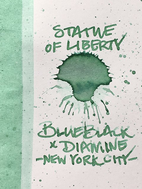
BlueBlack x Diamine - Statue of Liberty - Ink Drop
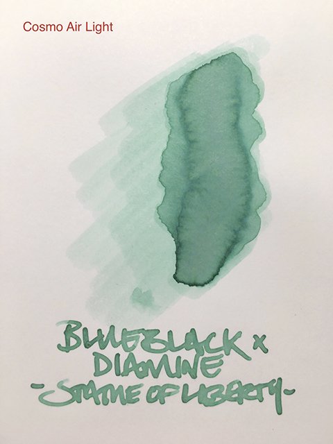
Statue of Liberty on Cosmo Air Light
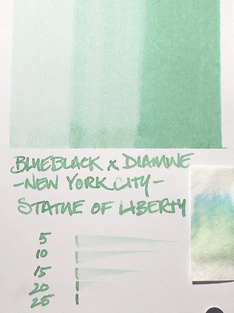
It’s no surprise that this ink is dedicated to the Statue of Liberty! This is a delicious patina mint green, and immediately brings the statue to mind. You might expect hints of blue, but you’ll find very little at all. It’s a soft and gentle pastel, but it isn’t shy and always remains easily readable. Some inks in this range of color fade and pale in a way that is hard on the eyes, but that’s not a problem here.
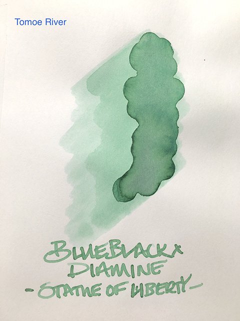
Statue of Liberty on Tomoe River Paper
Like the statue, this ink holds secrets. It’s a dual-shading ink on many coated papers. Stroke centers often reveal traces of peachy oranges and pinks. There’s some decent shading on stroke ends, and a dark halo stroke edging that keeps it sharp and very well defined.
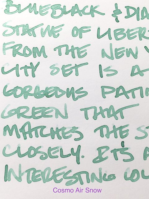
Writing Sample on Cosmo Air Snow
On uncoated papers, it shades along each stroke from light to dark. You don’t get the secondary colors, but the minty greens of the base color are unusual and impressive.
Here’s a quick, side-by-side comparison of Statue of Liberty and Skyscrapers from the same set. While there are strong similarities in these aquamarines, there are strong differences, as well. While Skyscrapers leans blue, Statue of Liberty equally leans green. You get both sides of aquamarine in the two inks.
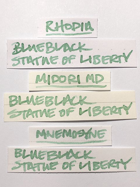
Statue of Liberty - Writing Samples
In writing performance, this is a nice wet ink. I didn’t find any problems with feathering, and even on cheap copy paper, there was no real showthrough. Drying ranged from fast to average, but don’t expect much water resistance. If it rains on this statue, you’re out of luck!
Statue of Liberty - Ink Swatch Card
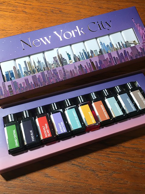
Statue of Liberty is an unusual ink, and I think it adds a lot of interest to BlueBlack’s New York City set. I like this ink, and the set itself is wonderfully done. I really hope they continue to expand the series, and we see sets released for more cities in the future!
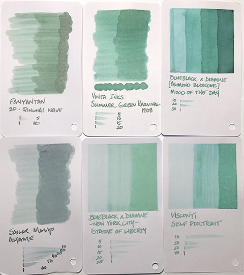
Statue of Liberty - Swatch Card Comparisons
Special thanks to BlueBlack for surprising me with this amazing set! Their store in Seoul is a must see for pen and ink lovers, and if you have a chance to stop by, definitely do!
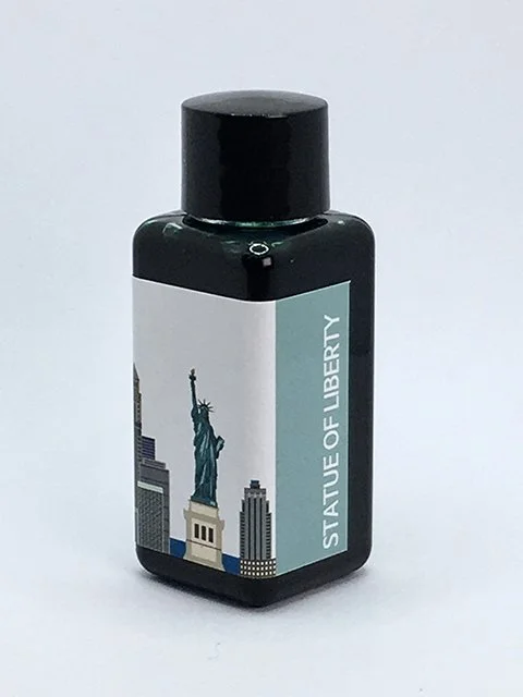
BlueBlack x Diamine Statue of Liberty - Ink Bottle
BlueBlack x Diamine - New York City Set

