BlueBlack x Diamine - Grand Central
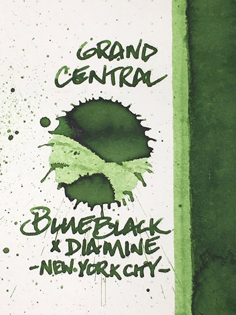
BlueBlack x Diamine - Grand Central - Ink Drop
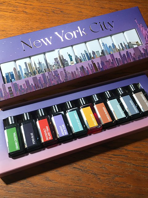
Grand Central is the true green in the New York City ink set from BlueBlack. BlueBlack’s City series also includes sets for Seoul and London. They worked with Diamine to create the inks that are themed around each city’s cultural icons and landmarks. The beautifully designed packaging and labels were designed by BlueBlack and feature the city’s skyline.
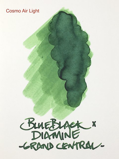
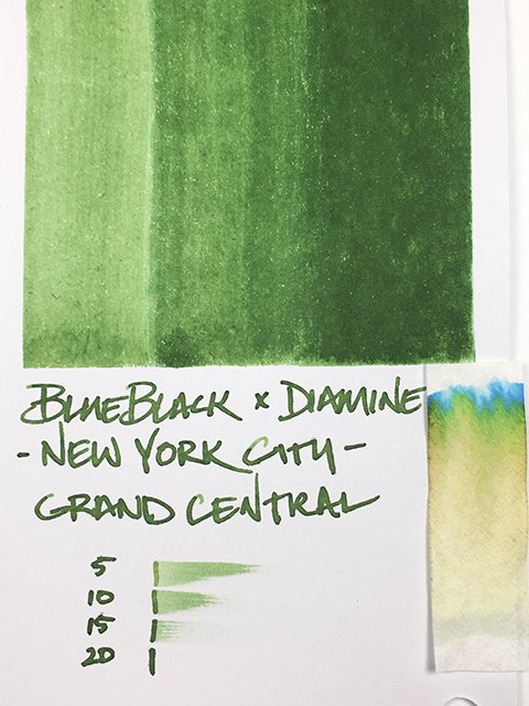
Grand Central on Cosmo Air Light
Grand Central is named for Manhattan’s famous train station, but this lovely green makes me think more of New York’s Central Park. It’s a beautifully fresh garden green. I think it’s one of my new favorite greens. They did a wonderful job giving it a really lush and lively look and feel.
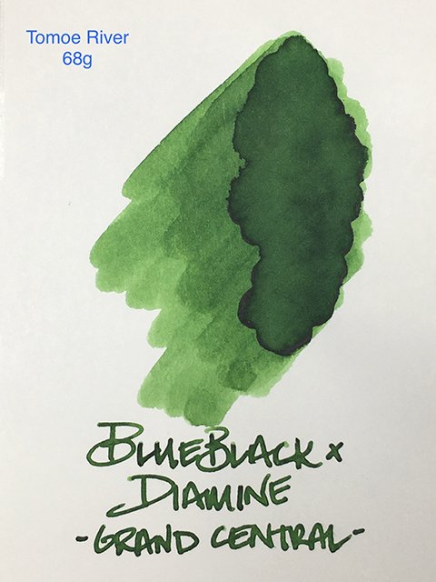
Grand Central on Tomoe River 68g Paper
The swatches on Cosmo Air Light and Tomoe River (68 gsm) paper are equally attractive. They show the interesting blends and base colors that you’ll find. It has a powdery aspect on Cosmo Air Light, and the yellow influences are stronger on Tomoe River.
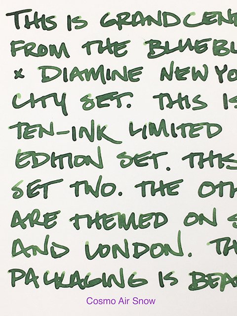
Writing Sample on Cosmo Air Snow
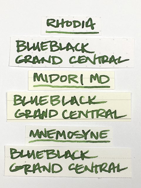
Check out all of the writing samples. On coated papers, there’s a nice, darkened edging and strokes are razor sharp! There’s a bit of shading that adds interest and contrast, too. On uncoated papers, the shading is more gradual, and the yellow aspects are more visible. Strokes were clean on all.
Grand Central - Writing Samples
It’s a wet ink in flow. On paper, it’s not surprising that it feels very comfortable, just like so many of the popular Diamine inks. Drying times were average or better on all papers. Even on cheap copy paper, showthrough is minimal and there’s no bleed. It’s an excellent writing ink with a positive personality.
Grand Central - Ink Swatch Card
This is a great start to a beautiful set. Grand Central is a delicious green and a pleasure on the page!
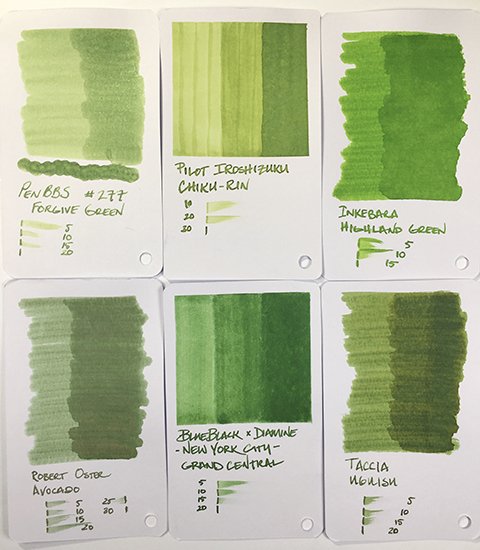
Grand Central - Swatch Card Comparisons
Special thanks to BlueBlack for surprising me with this amazing set! Their store in Seoul is a must see for pen and ink lovers, and if you have a chance to stop by, definitely do!
BlueBlack x Diamine Grand Central - Ink Bottle
BlueBlack x Diamine - New York City Set

