Van Dieman’s - Devil’s Kitchen
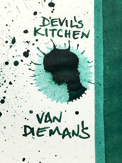
Van Dieman’s - Devil’s Kitchen - Ink drop
Please note: This is the original color formulation. This ink has been adjusted to create a blue result, as opposed to the greener base shown here. I will add the newer version in the future.
Devil’s Kitchen is from Van Dieman’s Inks in Australia. It’s part of their 4th series, the Wilderness, which is inspired by the beauty of Tasmania’s wilds. The name comes from a popular spot on the S.E. Tasman peninsula. Devil’s Kitchen was once a sea cave, but lost its roof, and is now a sea trench. It offers stunning views of coastal rock formations and the surging sea.
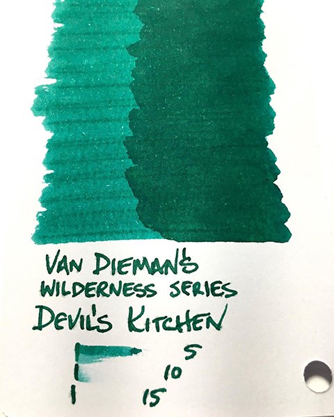
Visually, this is an attractive ink, but I expected much a bit more blue to show. The website shows a blue, bordering on teal. I found a mid-to-dark, emerald green bordering slightly on teal. There is a blue undertone, but the ink is too green to really call it a teal. The ink shades nicely on some papers, less on others. It lightens to a minty green. The splatter shows a dark edging and a black sheen, but in writing it doesn’t darken or sheen. Although, on uncoated premium papers, there was a mild halo. It’s a nice green, overall.
Van Dieman’s - Deciduous Beech - Ink Swatch Card
As a writing ink, it was smooth-flowing and performed well. Stroke profiles were crisp and clean on all premiums, and fairly clean on office copy. Shading was strongest on Mnemosyne and Apica, and decent on office copy, as well. I didn’t get any halo on coated papers or office copy, but it showed well on uncoated premiums which is opposite from most inks. Drying ranged from 25-35 seconds on Rhodia, to 10-20 seconds on Mnemosyne and Fabriano. Drying on office copy was under 5 seconds.
For best results, I recommend choosing uncoated premium papers, and pens that aren’t overly wet. It’s a pretty green, and writes nicely, too. If you don’t expect a blue teal, you’ll probably be very happy.


