Tono & Lims - Kondo is Perpendicular
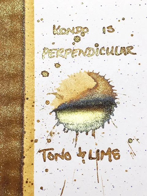
Tono & Lims - Kondo Is Perpendicular - Ink drop
Of all the inks that I’ve profiled, this ink produced one of the most beautiful splatters! From Tono & Lims’ Friendship line, this ink is called Kondo is Perpendicular, the name’s inspiration is a mystery to me, but I love the ink!
Tono & Lims - Kondo Is Perpendicular - Variation
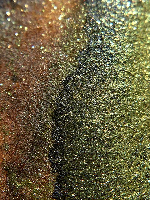
The splatter shows coloration that reminds me of a beautiful fish! The ink blends rich, earthy yellows, browns, and shimmering greens and golds to produce a stunning visual. The base color is a brownish yellow that shades lighter and darker across strokes. It brings to mind hints of Vinta La Paz, KWZ Honey, and Kyo No Oto Yamabuki-iro (3 of my favorites). What takes it way beyond those, however, is the bold use of green and gold shimmer. It’s an incredible combination!
Tono & Lims - Kondo Is Perpendicular - Shading
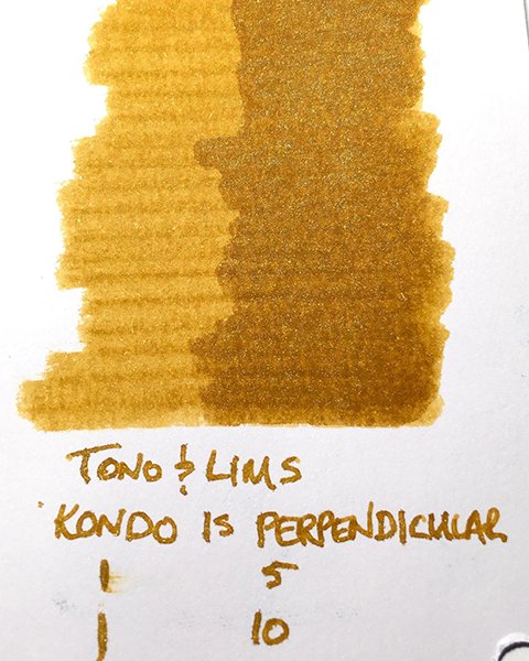
The ink writes beautifully. Tono & Lims’ shimmers are extremely fine-particled, and they have almost never caused me any concern. This is a neutral ink, in terms of wetness, but it writes very comfortably and flows smoothly. Strokes were crisp on all papers. Stick with premiums to get all of the lovely shading and the edge halo. Drying was fast at 10-15 seconds on premiums, and under 5 seconds on office copy.
Tono & Lims - Kondo Is Perpendicular - Green and Gold
This is a unique, but very natural combination of colors, and it’s truly gorgeous! If you think you might like it, I guarantee that you’ll love it!
Tono & Lims - Kondo Is Perpendicular - Ink Swatch Card


