Robert Oster - Australian Opal Grey
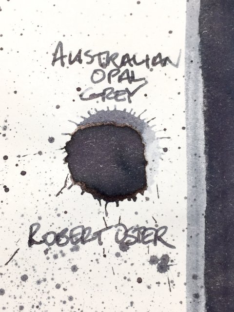
Robert Oster - Australian Opal Grey - Ink drop
This ink is a real beauty! There is a lot of movement and a wide range of color within this gorgeous grey from Robert Oster. It isn’t an official set, but Robert Oster has three inks named Australian Opal X. I have reviews up for the pink, and the blue versions as well, but this is Australian Opal Grey.
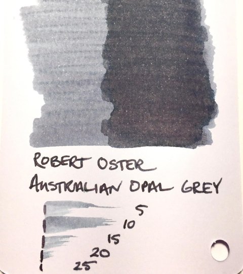
Opals are prized for the multitude of shades and colors within each stone, and their iridescent and pearlescent beauty. Visually, Australian Opal Grey lives up to its namesake gem. This is a prolific shading ink. From the medium graphite grey base (think HB or F pencil), the ink dances between lights and darks. Light areas take on a beautiful, powdery light grey (maybe a 4H pencil). It goes further on some papers (Mnemosyne was best), and mimics the gem’s pearlescence, with subtle hints of pink, blue, and yellow undertones visible within the greys. This stunning grey is a visual treat!
Robert Oster - Australian Opal Grey - Ink swatch card
As a writing ink, this is a very stable, consistent performer. Strokes were crisp and clean on all six test papers. Shading was visible on all six, as well, but strongest on coated premiums. The splatter shows darkened edging and sheen, but neither appeared in writing. Drying was again consistent, at 10-15 seconds on premiums and 5-10 on office copy. It was very nice on all six papers.
This is a very attractive grey. The variation in shading, and the hints of hidden color really are stunning, and bring the gemstone to mind. Without question, this is one of my favorite greys. I love the convenience of being able to use it with any paper, but for a real treat, I recommend Mnemosyne. It produced the widest variation in shade and coloration. With beautiful colors, strong shading, flexibility, and fast drying, what more could you want in a grey?


