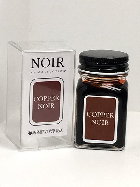
Monteverde - Copper Noir
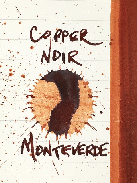
Monteverde - Copper Noir - Ink Drop on Midori MD
Monteverde released the ten-ink Noir set at the beginning of 2018. The inks are available as a set or individually in 30 ml or 90 ml bottles. These are interesting inks that combine various colors with a bit of black to create shadowy, intriguing hybrids. On good quality papers, this is a very nice ink, and I didn’t find any real problems with the crusting issues that some burnt oranges suffer. Monteverde asked if there were a few inks that I wanted to try, and a couple from the Noir series were instant choices.
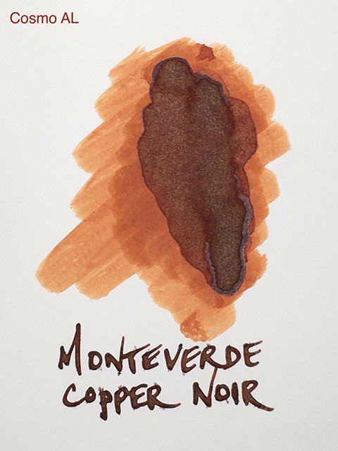
Monteverde - Copper Noir - on Cosmo Air Light
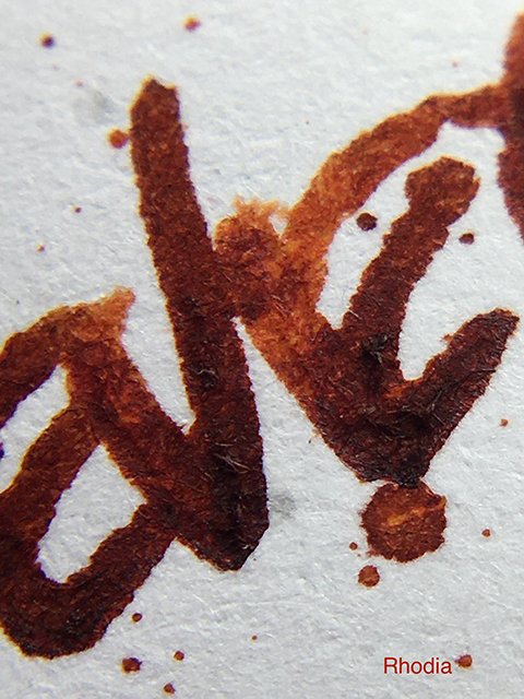
Monteverde Copper Noir is quite interesting in that the range of tones and shades you find really changes based on the paper and nib width you use. The base color is a rich and rusty, reddish-brown orange. Wider nibs result in darker, richer strokes, and the black ink influences are clear. In thinner nibs, the burnt oranges are more dominant. This is a color range that I really enjoy.
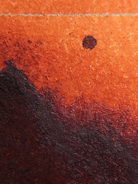
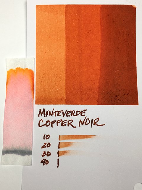
Monteverde - Copper Noir - Color Range
Coated papers bring out more shading and sharper stroke profiles. Shading is consistent from medium to dark, and only rarely goes really light. On uncoated papers, I see it much more as a reddish brown once it dries. There’s not much shading on uncoated papers at all, but it’s a steady, pretty result. In fact, all of the results were attractive, and it gives you a wide range. I’d have difficulty choosing a preference.
Monteverde - Copper Noir - on Rhodia
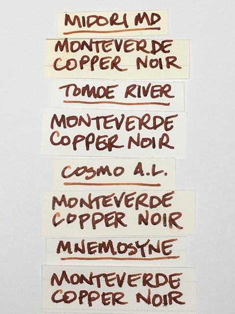
Writing performance was good overall, but I prefer the sharpness on coated papers. On uncoated there is a slight spread and some ghosting, but strokes are still very nice, especially for everyday writing. There were hints of feathering on a couple of papers (Apica, Mnemosyne, and card stock were notable), but it’s very nice on most high-quality papers.
Monteverde - Copper Noir - Writing Samples
Flow was neutral, and just the slightest bit dry in some nibs and pens. I found it very comfortable, overall. Drying was never slower than average, and as I mentioned, crusting in the feed was not the problem it can be in this color range.
Monteverde - Copper Noir - Ink Swatch Card
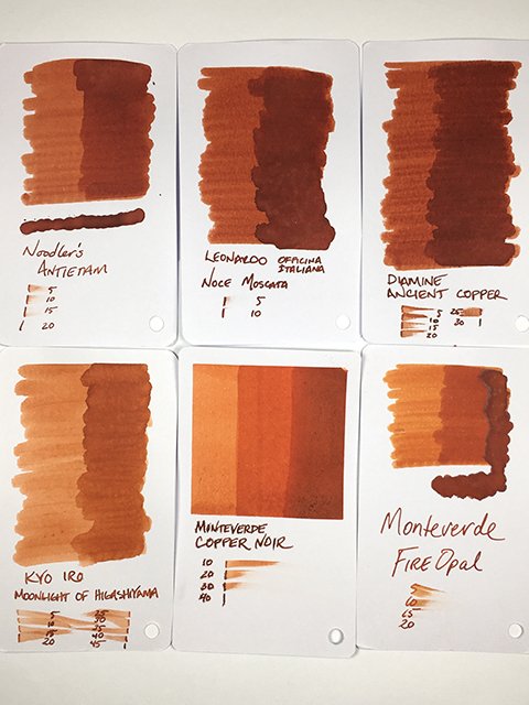
I really like the various looks of Copper Noir. There’s less black influence than I imagined, but it’s very attractive and compares nicely with some of my favorites in the color range. Use this with compatible papers, and medium or finer nibs for best writing performance. I think you’ll enjoy this one.
Special thanks to Yafa Brands, and Monteverde Inks for sending this and several other from the Monteverde catalog!
Keep scrolling for some swatch card comparisons and a look at the bottle and box!
Monteverde - Copper Noir - Comparisons
Monteverde - Copper Noir - 30 ml Bottle and Box
