Kyo-iro - Stone Road of Gion
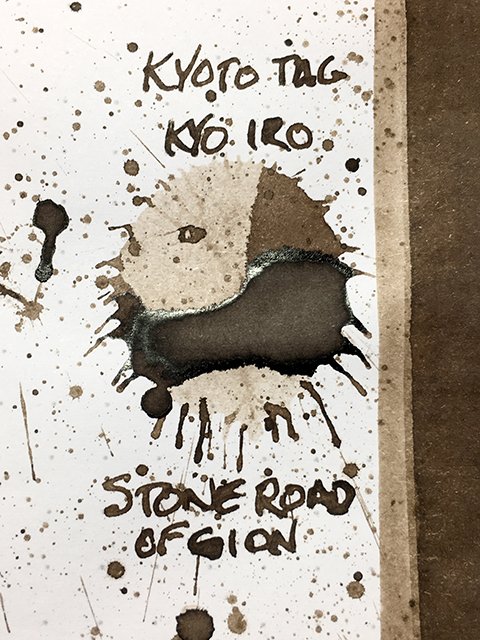
Kyo-iro Stone Road of Gion - ink drop
Today’s ink, Stone Road of Gion, is part of the Kyo-iro line of inks made by Takeda Jimuki for their Kyoto-based TAG Stationery stores. Kyo-iro inks are inspired by the colors (iro) of Kyoto (kyo). This ink’s poetic name comes from the willow-lined, canal-side, cobblestone walking road in the scenic Shirakawa area in Gion. Gion is the traditional entertainment district in Kyoto. It’s famous for its well-preserved machiya (thin, wooden shophouses) with high-end restaurants, izakayas (drinking houses), and exclusive ochaya (teahouses with geiko & maiko hostesses).
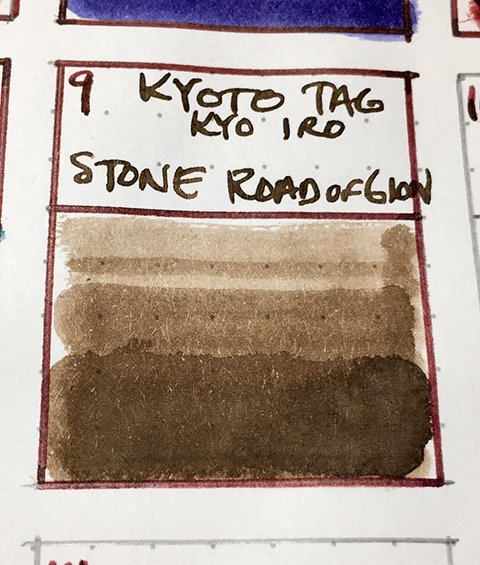
Kyo-iro Stone Road of Gion - color range
Stone Road of Gion is a gorgeous, cool, grey-brown, and a very nice shading ink! Like the cobblestones, it’s a lovely patchwork of light, medium, and darker shades. In the splatter, areas of pooling are surrounded by dark edges topped with a silver sheen. On higher-quality papers, there are hints of sheen in writing, but the dark edge clearly shows up as stroke halos. Visually, this is an impressive ink.
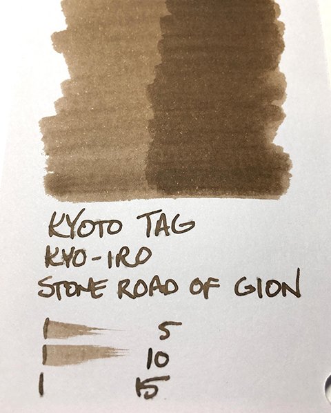
As a writing ink, it performed well on all five test papers. It’s slightly dry, but not overly so. Stroke profile was very crisp on Rhodia, Mnemosyne, Kokuyo, & Apica. Shading and halo were strong on all four, as well. Drying times ranged from 10-20 seconds on Apica to 20-30 on Kokuyo. It was nice on all four, but Mnemosyne and Apica were my favorites. There was slight feathering on office copy, but it was still very usable.
Kyo-iro Stone Road of Gion - ink swatch card
Kyo-iro Stone Road of Gion is a lovely, sophisticated ink. In a professional setting, it’s a great alternative to greys, blacks, and blue blacks and equally appropriate. Kyoto TAG inks aren’t the cheapest, but they’re consistent and interesting. I highly recommend a stroll on the Stone Road of Gion!
November 2020


