IWI - Pure Brightness
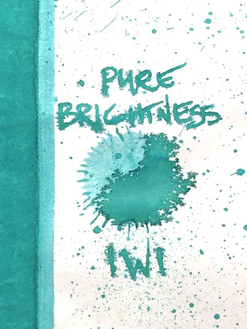
IWI - Pure Brightness - ink drop
Today is another of three samples recently picked up from International Writing Instruments’ (IWI) Colors of Nature series, and the fourth IWI that I’ve reviewed from the 24-ink series. This is Pure Brightness from the six spring inks in the series.
IWI - Pure Brightness - beautiful shades and range!
Pure Brightness is a brilliant, sun-drenched, blue-green aquamarine. It’s inviting and brings tropical paradise to mind to an almost distracting degree! Coloration varies a bit based on paper choice. On some, green aspects dominate with yellows lurking just below the surface. On others, it’s a true balance between greens and blues with light areas leaning blue. There’s nice shading, which adds movement and variety, as well. This is a very attractive blend.
IWI - Pure Brightness - edge
In writing, it’s a fairly wet ink with nice, smooth flow, but it dries pretty quickly, too. Despite what you see in the splatter, feathering was better than it was with some of the others from IWI, but it was still a problem on some papers. Once again, both HP BrightWhite 24 and Xerox Bold Digital controlled the feathering, but Fabriano, Kokuyo, and Mnemosyne did well, too. Unlike the previous two IWI inks from the series, there wasn’t much water-resistance this time, and the pretty chromatography backs that up.
IWI - Pure Brightness - ink swatch card
Paired with the right paper, Pure Brightness and the other IWI inks tested are attractive, interesting, and perform fairly well. However, they can be prone to feathering on some otherwise reliable papers. These can be very picky inks, but when they work well, they’re quite nice. Pure Brightness worked well on a variety of papers, overall. It’s easier to manage than some in the series. It's also an infectious blue-green aquamarine that oozes tranquil feelings. It's quite beautiful! On the right papers, you'll really like it.
IWI - Pure Brightness - ink swatch comparisons
IWI - Pure Brightness - Complex!


