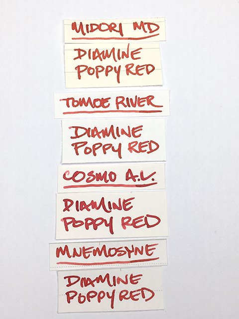
Diamine - Poppy Red
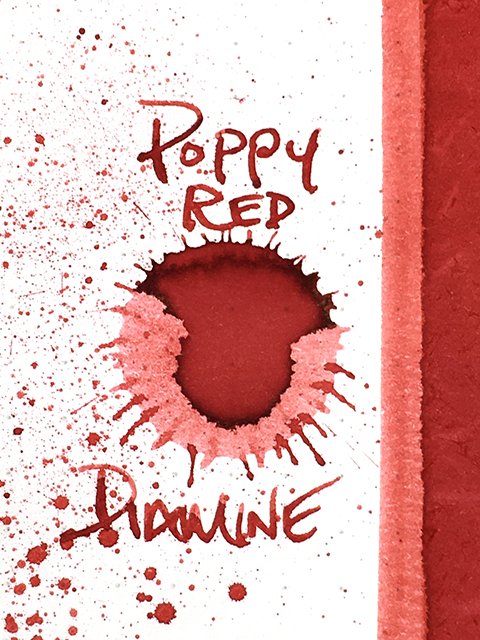
Diamine - Poppy Red - Ink Drop
Steady and reliable, that’s what you almost always find with Diamine inks, and Poppy Red lives up to those expectations. Released in 2006, it’s one of the cleanest and proudest reds in their deep lineup. You can find it in the 30 ml and 80 ml bottles, and Diamine’s standard inks are some of the most attractively priced inks on the market.
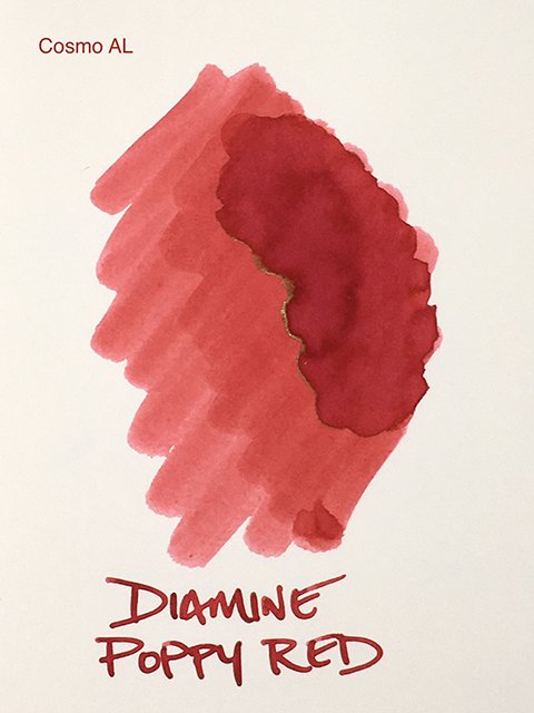
Swatch and Strokes on Cosmo Air Light
This is a bright and energetic red. As the chromatography shows, there are potent influences of pink magenta and orange that make up this confident color. Poppy Red balances the two well and never leans far in either direction. The result is something that I think a lot of people look for when they think of a red.
Color Range
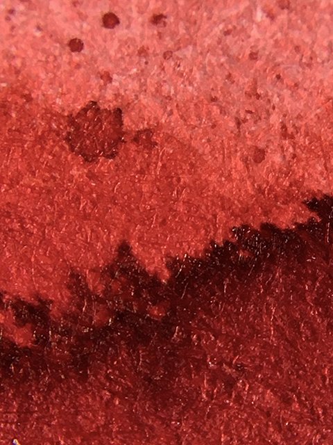
From medium to dark, there’s some shading on coated papers, but this isn’t a strong shading ink overall. There’s enough to keep it interesting and add a hint of movement. On the ink drop, there’s a thin edge of gold sheen, but I didn’t find any in writing. This is an ink you choose for the confidence of the color, and I doubt you’ll be dissatisfied.
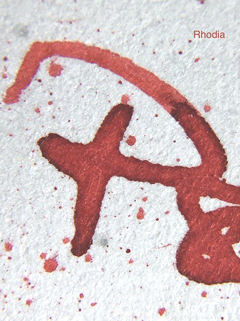
Clean Strokes on Rhodia
Writing performance is exactly what you expect. It’s a nice writing ink, and very consistent. Flow was neutral to slightly wet, and it feels very much like a Diamine ink. On high-quality papers, strokes were clean and crisp in profile. On cheaper copy paper, there was a small amount of spread at the most saturated stroke ends, but I wouldn’t say that it really feathers. It was acceptable on most uncoated papers. Ghosting was minimal, especially for a red ink, and there’s little to no bleed. At around 30 seconds, drying times weren’t too bad, either.
Writing Samples
Diamine Poppy Red is a beautiful red, and it performs very well. This is a very good choice if you’re looking for a medium red. For editing, I think this is exactly what a lot of people want. It’s an easy recommendation!
Keep scrolling for a look at the ink swatch, ink comparisons, and the 30 ml bottle.
Ink Swatch Card
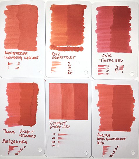
Ink Swatch Comparisons
Poppy Red in the 30 ml Bottle

